Home Interior Color Palettes and the Psychology Behind Them
By Homely Ideas | homelyideaes.com
Color is the most powerful tool in interior design, and also the most misunderstood. A single paint choice can make a room feel spacious or cramped, calm or energetic, expensive or cheap. Yet many people choose colors at the last minute, by picking a swatch under the harsh lights of a hardware store and hoping for the best. The result is often a home that feels slightly off, with colors that clash, rooms that feel disconnected, or walls that look nothing like the sample.
The good news is that color is not magic. It follows rules, and once you understand them, choosing a palette becomes a confident, even enjoyable process. In this complete guide, you will learn how color works, how it affects mood and behavior, and how to build palettes that suit each room and your whole home. We will cover the color wheel, undertones, the 60-30-10 rule, light and color, the psychology of each major color, palettes for every room, popular palette ideas, how to connect rooms, how to test samples, finishes, small-room color tricks, common mistakes, and a practical step-by-step process.
Understanding the Basics of Color
Before choosing colors, it helps to learn the vocabulary designers use. These few concepts explain almost everything you see.
The Color Wheel
The color wheel organizes colors in a circle and shows how they relate. It has three layers:
- Primary colors: red, yellow, and blue. They cannot be made by mixing other colors.
- Secondary colors: orange, green, and purple, each made by mixing two primaries.
- Tertiary colors: colors such as teal, chartreuse, and magenta, made by mixing a primary with a neighboring secondary.
Hue, Saturation, Value, and Tone
Every color has four properties: - Hue is the basic color family, such as blue or green.
- Saturation is how intense or pure the color is. Highly saturated colors are vivid, while low-saturation colors look muted or grayed.
- Value is how light or dark the color is.
- Tone is the result of adding gray, which creates sophisticated, softened versions of a color.
Most beautiful home palettes rely on low-saturation, softened tones instead of pure, bright ones. That is why a muted sage looks calm and elegant, while a pure lime green feels loud.
Warm vs. Cool Colors
Colors are generally divided into warm and cool: - Warm colors, such as red, orange, yellow, and warm beige, feel cozy, energetic, and close. They make large rooms feel more intimate.
- Cool colors, such as blue, green, and gray, feel calm, fresh, and distant. They can make small rooms feel more spacious.
Neutrals can also be warm or cool, which brings us to undertones.
Undertones: The Secret Behind “Why Does This White Look Pink?”
Every neutral has an undertone, a subtle hint of another color. A white may lean yellow (warm), pink, blue, or green. A gray may lean blue, purple, green, or brown (greige). A beige may lean pink, yellow, or green. When you place two neutrals with conflicting undertones side by side, the room can look dirty or unbalanced.
To identify an undertone, compare the swatch with a piece of pure white paper. The differences will become clear. Then choose all your neutrals, including wall paint, flooring, countertops, and large furniture, with consistent undertones. If your floor is warm oak with a yellow-orange undertone, a cool blue-gray wall may clash, while a warm greige will harmonize.
Color Harmonies
Designers combine colors using a few classic schemes:
- Monochromatic: different shades and tints of one hue. It is calm, cohesive, and nearly foolproof.
- Analogous: colors next to each other on the wheel, such as blue, blue-green, and green. It feels natural and harmonious.
- Complementary: colors opposite each other, such as blue and orange. It is vibrant and energetic, best used with one color dominant and the other as an accent.
- Split-complementary: one color plus the two colors next to its complement. It has contrast with less tension.
- Triadic: three colors evenly spaced on the wheel. It is playful and bold, and needs careful balance.
- Neutral with accent: a foundation of neutrals with one or two colors for personality. It is the most common and flexible approach in homes.
The 60-30-10 Rule
The most useful rule for building a room palette is the 60-30-10 rule. It divides the colors into three proportions:
- 60% dominant color: the color that covers most of the room, usually walls, large rugs, and big furniture.
- 30% secondary color: a supporting color in curtains, an accent chair, bedding, or a feature wall.
- 10% accent color: a punch of color in cushions, art, vases, and small objects.
This ratio creates balance. Too many colors at equal strength create chaos, while one color everywhere becomes flat. If you are unsure, begin with a neutral dominant color, a softer secondary color, and a bolder accent. You can also vary the rule slightly, but keep the dominant color clearly dominant.
How Light Changes Color
Color is not a property of the paint alone. It is the result of paint and light interacting. The same paint can look completely different at different times and in different rooms.
Natural Light by Direction - North-facing rooms receive cool, indirect, bluish light. Colors can appear flatter and cooler, so warm shades with a hint of yellow or red often work best.
- South-facing rooms receive warm, bright light most of the day. They can handle cool colors well and look beautiful in almost any palette.
- East-facing rooms have warm, golden light in the morning and cooler light later. They suit colors that look good in the morning, such as soft yellows and fresh whites.
- West-facing rooms have cool light during the day and warm, orange light in the evening. Colors can look dramatically different at sunset, so test carefully.
These directions apply to the northern hemisphere. In the southern hemisphere, the north and south are reversed.
Artificial Light
Bulbs change color too. Warm bulbs (2700K) bring out the yellow and red tones in a color, while cool bulbs (4000K and above) make colors appear bluer and flatter. Always judge paint under the type of lighting you will use in the room, and in the evening as well as the daytime.
Light Reflectance Value
Paint labels often show a Light Reflectance Value (LRV), on a scale from 0 (black) to 100 (white). A higher LRV reflects more light and makes a room feel brighter, while a low LRV absorbs light and creates a cozy, enveloping effect. Rooms with little natural light often benefit from colors with a higher LRV, unless you are deliberately going for a moody effect.
The Psychology of Color
Color affects how we feel, though its influence varies by culture, personal experience, and context. Research in color psychology gives general patterns, not strict rules, so treat these as helpful guidelines, not guarantees.
Blue: Calm and Trust
Blue is widely associated with calm, stability, and peace. Soft blues feel restful and are popular for bedrooms and bathrooms. Deeper navy conveys sophistication and depth. Very cool or icy blues can feel cold in rooms with little sun, so warm them with wood and soft textiles.
Green: Balance and Renewal
Green reminds us of nature and is associated with balance, freshness, and restoration. Sage and olive tones are calming and versatile. Deep emerald and forest green feel luxurious and enveloping. Green works almost anywhere, from living rooms to kitchens to home offices.
Yellow: Energy and Optimism
Yellow is cheerful and energetic, and it brings the feeling of sunlight. Soft butter and cream tones feel warm and welcoming. Bright, saturated yellow can be overstimulating when used in large amounts, so it is best used in kitchens, entryways, and as an accent.
Red: Passion and Appetite
Red is intense, stimulating, and attention-grabbing. It is often linked to warmth, energy, and appetite, which is why it appears in dining rooms and restaurants. Use it carefully. Deeper tones such as burgundy, brick, and terracotta are more livable than bright red.
Orange: Warmth and Sociability
Orange is friendly and lively. Soft peach and terracotta tones are warm and welcoming, and suit living areas, kitchens, and dining spaces. Strong orange is best used as an accent.
Purple: Luxury and Creativity
Purple has long been associated with luxury and imagination. Soft lavender and lilac can be soothing in bedrooms, while deep plum and aubergine add drama and richness. Use with care, as some purples can feel heavy.
Pink: Softness and Comfort
Pink ranges from playful to sophisticated. Blush and dusty rose have become popular neutrals that feel gentle and warm, while stronger pinks add fun and personality to creative spaces.
Brown and Earth Tones: Stability and Warmth
Brown, tan, and clay tones feel grounded, natural, and secure. Combined with cream and green, they create a warm, organic atmosphere that suits living rooms, studies, and cozy corners.
White: Clarity and Space
White feels clean, fresh, and open. It reflects light and makes spaces feel larger, but pure white can feel stark or clinical. Choose a white with the right undertone, such as warm white for coziness or crisp white for a modern look.
Gray: Neutral and Sophisticated
Gray is calm, modern, and versatile, but a cold gray used everywhere can feel dreary. Warm grays, or greige, and soft charcoal feel more inviting. Combine with warm woods, textiles, and plants.
Black: Drama and Elegance
Black adds depth, contrast, and sophistication. Used in small touches, such as window frames, hardware, and furniture legs, it gives definition. Used on walls, it can create a bold, intimate atmosphere in the right room with good lighting.
Choosing Colors Room by Room
While you should have a coherent palette across the home, each room has its own function and mood.
Living Room
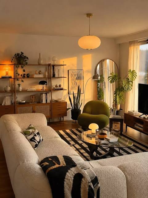
The living room is a social space, so welcoming, balanced colors work best. Warm neutrals such as cream, beige, and greige are the safest option, and muted greens, soft blues, and terracotta add warmth and personality. Add a rich accent color in cushions, art, and a rug. For a more dramatic feel, a deep green or navy on one wall or on built-in shelves creates a focal point.
Kitchen
Kitchens benefit from fresh, clean colors that make the room feel bright and hygienic. White, soft gray, sage green, and warm cream are classics. Navy or deep green lower cabinets with lighter uppers create a stylish contrast. Yellow and orange accents are cheerful and appetizing.
Dining Room
Dining rooms are often used in the evening, so they can handle richer, deeper colors. Deep green, burgundy, navy, and terracotta create intimacy and elegance under warm lighting. Lighter schemes of cream and soft blue feel airy and relaxed for daytime dining.
Bedroom
Bedrooms call for restful colors. Soft blues, sage greens, warm grays, lavender, blush, and creamy whites support relaxation and sleep. Avoid highly stimulating colors, such as bright red or neon, in places where you need to rest. If you love drama, deep, muted tones such as dark green and navy can feel cocooning.
Bathroom
Bathrooms suit clean, spa-like colors. White, soft blue, sage, and sand evoke a sense of calm and cleanliness. Deep tones in a small bathroom can feel luxurious when paired with good lighting.
Home Office
For concentration, balanced mid-tones work well. Soft green and blue support calm focus, while a touch of warm yellow or orange adds energy. Avoid colors that are too bright or too dark, which can cause distraction or fatigue.
Children’s Rooms
Children respond to color, but their rooms should not be overstimulating. Soft, cheerful tones such as pale yellow, mint, light blue, and warm gray make a flexible base, with brighter accents in toys, bedding, and art. A neutral base makes it easy to update the room as the child grows.
Entryway and Hallways
These spaces set the tone for the home. Warm, welcoming colors make a good first impression, while lighter colors help narrow or dark halls feel brighter. A bolder color in a small entryway can be a delightful surprise.
Outdoor Spaces
Balconies and patios work best with colors that connect to the garden and sky, such as greens, whites, and natural wood, with pops of bright color in cushions and pots.
Popular Color Palette Ideas
Here are some proven palettes you can adapt for your own home.
Warm Neutral Palette
Warm white, beige, camel, and chocolate brown. Soft, cozy, and timeless. Add texture with linen, wool, and wood. It suits living rooms and bedrooms, and is easy to refresh with new accents.
Coastal Calm
White, sand, soft blue, and seafoam. Light, airy, and relaxing, with a fresh connection to the sea. It suits bedrooms, bathrooms, and living rooms, especially with natural fibers like jute and rattan.
Earthy and Organic
Terracotta, olive green, cream, and warm brown. Grounded and welcoming, it combines well with clay, wood, and plants.
Modern Monochrome
White, light gray, charcoal, and black. Crisp, graphic, and sophisticated. Soften with warm woods, plants, and textiles to avoid coldness.
Moody and Dramatic
Deep navy, forest green, charcoal, and brass. Rich, enveloping, and luxurious, especially in rooms used in the evening. Use warm lighting and rich textures.
Soft Scandinavian
White, light gray, pale wood, and muted blue or blush. Light, simple, and peaceful.
Boho and Eclectic
Mustard, rust, teal, cream, and warm wood. Layered, colorful, and personal. Balance with plenty of neutral space.
Pastel Modern
Soft pink, mint, pale yellow, and warm white. Fresh, gentle, and optimistic when used with restraint and good lighting.