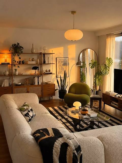
Colour Psychology in Home Design: How Colours Shape Mood, Comfort and Behaviour
Walk into a room painted soft green and you may feel your shoulders drop. Step into one with bright red walls and you may feel more alert, or slightly tense. These reactions are the heart of colour psychology: the study of how colours influence the way we think, feel and behave. In homes, where we eat, sleep, work and rest, those small influences add up over years.
Designers have used colour deliberately for centuries. Hospitals use soft greens and blues to calm patients. Restaurants use warm reds and oranges to create energy and conversation. Schools use bright accents to keep children engaged. Your home is no different, except that you can tune it to the people who live there.
What the science actually says
It is important to be honest about the evidence. Research does show that colour can affect mood, attention and perception. Studies have linked warm light and warm colours with feelings of cosiness, and cool blues and greens with relaxation. Brightness and saturation also matter, because very intense colours tend to be more stimulating, while soft, muted ones are more soothing.
However, colour psychology is not an exact science. Responses vary between people and cultures, and the effects are usually modest rather than dramatic. A blue bedroom will not cure insomnia, and a yellow kitchen will not guarantee a good mood. Personal memory also plays a large role: a person who loved a green garden as a child may find green deeply comforting, while someone else may associate the same shade with a hospital.
The best way to use colour psychology, therefore, is as a set of helpful tendencies, not strict laws. It gives you a starting point and vocabulary, and your own reactions make the final decision.
What this guide covers
This guide explains how colour influences people, and what each major colour usually communicates. You will learn how temperature, brightness and saturation change feeling, and how to choose colours room by room. It also looks at family needs such as children, elderly relatives and people who struggle with sleep or focus, and at cultural and climate factors that matter in South Asian homes. Finally, you will find a method for building a mood-based palette, plus common myths and a short FAQ.
Whether you are planning a full renovation or only repainting a single room, understanding how colour works on the mind will help you create a home that does more than look good: it will feel right.
How Colour Affects People
Colour reaches us through several routes at once. Understanding them explains why the same shade can feel calming to one person and dull to another.
The body responds to light and colour
Colour is light reaching the eye, and light influences the body. Bright, cool-toned daylight tells the body it is time to be awake, while warm, dim light signals that evening has arrived. This is why a cool blue-white room at night can make it harder to wind down, and why warm, low lamps help us relax. Colour on the walls interacts with this effect, because it changes how much light a room reflects and how warm or cool that light feels.
The mind attaches meaning
We learn associations from nature and experience. Green suggests plants, growth and freshness. Blue suggests sky and water. Red suggests fire, ripe fruit and warning. Yellow suggests sunshine. These links appear in many cultures, which is why they are useful in design, although exact meanings still vary.
Memory and personal history
Personal experience often overrides general rules. A pale pink may feel soothing to one person because of a happy childhood room and irritating to another. Pay attention to your own reactions: if a colour makes you uneasy, no design rule should convince you to live with it.
Culture shapes interpretation
White, for example, means purity and weddings in many Western cultures, but mourning in several Asian traditions. Red is a colour of luck and celebration in China and in South Asian weddings, while in some contexts it signals danger. If you share your home with a family that has strong cultural traditions, take these associations into account.
Perception of space, weight and temperature
Colour also tricks the eye about physical qualities:
- Size: light colours seem to expand a room, while dark ones seem to close it in.
- Weight: dark colours feel heavy, and light ones feel light. A dark ceiling can feel low and a light floor can feel as if it floats.
- Temperature: people in rooms painted in warm colours often report feeling slightly warmer than people in rooms painted in cool colours, even when the real temperature is the same.
- Distance: warm colours seem to advance toward the viewer, and cool colours seem to recede.
Energy versus calm
One simple way to think about colour is on a scale between stimulating and soothing. Saturated warm colours, such as bright red and orange, tend to energise. Soft cool colours, such as pale blue and sage, tend to soothe. Neutrals sit in the middle and let other elements lead. Most homes need a mix: lively colours in social areas, calmer ones in places for rest.
Colour by Colour: What Each One Usually Says
The notes below describe common tendencies. Remember that tone and saturation change the effect: a pale, muted version of any colour is calmer than the vivid version.
Red
Red is the most stimulating colour. It is linked with energy, passion, appetite and attention. In a home it works best in small doses or in places with short stays and lively activity, such as a dining room or an entrance. Deep, earthy reds such as brick or burgundy feel warm and rich, while bright red can quickly become tiring. Avoid large areas of strong red in bedrooms and workspaces.
Orange
Orange is warm, friendly and social. It feels cheerful and sociable, which suits kitchens, family rooms and casual dining areas. Softer shades such as peach, apricot and terracotta are easier to live with than bright orange, and they flatter skin tones and wood furniture.
Yellow
Yellow reminds people of sunshine and optimism. It can brighten dark rooms and make small kitchens feel cheerful. It is, however, the colour that most easily becomes too much: bright yellow in large amounts can feel harsh and may increase restlessness. Choose butter, cream or soft lemon, and use stronger yellows as accents.
Green
Green is the colour of nature, and it sits in the middle of the spectrum, which makes it easy on the eyes. It is linked with balance, renewal and calm, and it works nearly everywhere: bedrooms, studies, living rooms and kitchens. Sage, olive and soft mint feel gentle, while deep forest green feels cosy and elegant.
Blue
Blue is associated with calm, trust and clarity. Pale blues suit bedrooms and bathrooms, while mid-blues suit offices and studies. Very cool or dark blues can feel cold or sad in rooms with little sun, so balance them with warm light and wood tones. Navy is often used as a sophisticated alternative to black.
Purple
Purple combines the energy of red and the calm of blue. Lavender and lilac are soft and soothing, while deep plum and aubergine feel luxurious and moody. Because purple is strongly noticed, it is usually best as an accent or in a bedroom or dressing room.
Pink
Soft pinks feel gentle, nurturing and comforting. Dusty rose and blush are popular for bedrooms and nurseries and also pair well with greys and greens. Hot pink is far more energetic and works only in small touches.
Brown and earth tones
Browns, tans and clay colours feel stable, natural and secure. They bring warmth to rooms and pair easily with greens, creams and blues. Too much dark brown without light can feel heavy, so add pale colours and good lighting.
Grey
Grey is neutral, modern and calm. Warm greys (greige) feel soft and welcoming, while cool greys feel crisp and formal. Because grey can look cold and flat in dim rooms, use it with warm woods, textiles and layered lighting.
White
White is associated with cleanliness, space and simplicity. It reflects the most light and makes rooms feel open, but pure white can feel stark. Warm off-whites feel much more comfortable for living spaces.
Black and charcoal
Black suggests sophistication, depth and drama. In small amounts, such as frames, lamp bases and window details, it adds structure. As a full wall colour, it can feel enveloping, so it needs strong lighting and balance from lighter elements.
Summary table
Colour
Typical feeling
Best used for
Use with care in
Red
Energy, appetite, passion
Dining areas, accents
Bedrooms, study rooms
Orange
Warmth, sociability
Kitchens, family rooms
Rest areas, in bright shades
Yellow
Cheer, optimism
Kitchens, hallways
Large areas in strong shades
Green
Balance, calm, nature
Most rooms
Very dark, in small rooms
Blue
Calm, trust, focus
Bedrooms, bathrooms, studies
Dim rooms, in cold shades
Purple
Luxury, creativity
Accents, bedrooms
Large areas in bright shades
Pink
Gentle, comforting
Bedrooms, nurseries
Very bright pink
Brown
Stable, earthy
Living rooms, studies
Dark, large rooms
Grey
Modern, neutral
Living rooms, offices
Dim rooms, in cool shades
White
Clean, open
Ceilings, small rooms
Stark pure white everywhere
Black
Drama, depth
Accents, trim
Small, dark rooms in large areas
Temperature, Brightness and Saturation
Choosing a hue is only the first step. Three qualities of a colour decide most of its emotional effect.
Warm versus cool
Warm colours, such as red, orange, yellow and warm beige, feel inviting and close. They suit rooms where you want people to gather and talk. Cool colours, such as blue, green, grey and lavender, feel airy and calm. They suit rooms where you want to rest, concentrate or feel more space. Most successful homes combine both: for example, cool green walls with warm wood furniture and golden lamplight.
Light versus dark
Light colours reflect more light and make spaces feel open, clean and gentle. Dark colours absorb light and make spaces feel enclosed, intimate and dramatic. Neither is better. A dark, rich colour in a study or bedroom can feel like a cosy retreat, while the same shade in a small, dim hallway may feel oppressive.
Saturation: vivid versus muted
Saturation is how pure or intense a colour is. Highly saturated colours stimulate the eye and the mind. Muted, greyed-down colours, such as dusty blue or sage, feel quiet and sophisticated. For long-term living spaces, muted tones are generally more comfortable. Use high saturation sparingly in accents, such as one cushion, a door or a piece of art.
How the three work together
Quality
Increases…
Decreases…
Good for
Warmth
Cosiness, closeness
Sense of space
Social areas
Coolness
Calm, openness
Cosiness
Bedrooms, studies
Lightness
Airiness, brightness
Drama, intimacy
Small rooms
Darkness
Intimacy, drama
Openness
Evening rooms
Saturation
Energy, excitement
Restfulness
Accents
Muted tones
Calm, sophistication
Playfulness
Main walls
Contrast also matters
High contrast, such as black against white, feels sharp and energetic. Low contrast, such as beige against cream, feels soft and restful. For rooms meant for relaxation, choose colours close to one another in tone. For lively spaces, add stronger contrast through furniture, art and accessories.
Choosing Colours Room by Room
Every room asks for a different emotional effect. Match the purpose of the room to the mood of the colour.
Living room: welcoming and sociable
The living room needs to feel warm enough for conversation and relaxed enough for evenings. Warm neutrals, soft terracotta, muted green and gentle blue-greys all work. If your family uses the room for both guests and quiet evenings, choose a calm base and bring energy through cushions, art and plants so that you can change the mood easily.
Bedroom: rest and recovery
Bedrooms are best in low-saturation, cool or softly warm colours. Pale blue, sage, soft grey-green, lavender grey and warm cream help the mind slow down. Dark, moody tones such as deep navy or forest green can also feel restful when combined with soft lighting and good curtains. Avoid bright red, orange and neon colours near the bed, since they tend to stimulate.
Kitchen: freshness and appetite
Kitchens benefit from clean, fresh colours that feel hygienic and encouraging. Soft yellow, light green, cream and white are popular because they brighten the room and feel cheerful at breakfast time. Touches of warm orange or terracotta can support appetite and conversation. Avoid heavy, dark colours across all surfaces, which can make a working kitchen feel gloomy.
Dining room: conversation and appetite
Warm tones such as terracotta, deep red, rust and golden yellow encourage conversation and make food look appealing. Deep greens and blues work for formal dinners in the evening. If the dining area is open to the living room, keep its colours related so that the space feels connected.
Bathroom: cleanliness and calm
Pale blue, aqua, soft green, white and sand evoke water and cleanliness, and they create a spa-like feel. Warm neutrals prevent the room from feeling cold. Keep colours light in small, windowless bathrooms to make them feel bigger.
Home office or study: focus without fatigue
Blue and green support concentration and calm, while a little warm accent, such as a yellow or orange lamp or artwork, keeps energy up. Avoid very dark walls if you work from the room all day without good natural light, and avoid strong red, which can feel stressful.
Children’s rooms: stimulation and safety
Children respond to colour strongly, but they also need calm for sleep. Use soft warm or fresh colours on the walls, such as pale yellow, mint or sky blue, and bring in brighter accents through toys, rugs and bedding. For study corners, choose calm shades that help concentration, and for play areas allow more colour and pattern.
Elderly relatives’ rooms: clarity and comfort
Older eyes need more light and clearer contrast. Choose warm, light colours and make sure that doors, switches, furniture edges and floors contrast with the walls. Avoid very low-contrast schemes, which make it hard to see objects, and glare from glossy surfaces.
Hallway and entrance: welcome
A warm, light colour makes guests feel welcome, while a bold entrance door gives character. Because hallways are often dark, choose light shades with warm undertones to lift the space.
Prayer and quiet rooms
If you have a room for prayer, meditation or reading, choose soft, low-contrast colours such as cream, pale green, sand or light grey-blue. Keep decoration limited so the space supports stillness.
Colour and Family Needs
A home is shared by people with different ages, habits and sensitivities. Colour can quietly support each of them.
Need
Helpful colour approach
What to avoid
Better sleep
Muted blues, greens and warm neutrals; low contrast; warm bedside light
Bright reds, strong oranges, glossy bright walls
Focus and study
Soft blue, green, warm grey; a small warm accent
Busy patterns, strong red, very dark walls with poor lighting
Anxiety or overstimulation
Soft, muted, low-contrast palettes in sage, sand, cream
Many competing colours, high saturation
Low mood or lack of light
Warm, light colours such as cream, soft yellow, peach; plenty of lighting
Cold grey or dark colours in dim rooms
Active social home
Warm accents, lively art, a few brighter colours in shared areas
Overly quiet palettes with no focal points
Young children
Soft colours on walls; bright colours in toys and rugs
Very dark walls, harsh neon colours
Elderly members
Light, warm colours; strong contrast on edges and doors
Low-contrast schemes, glare and shiny floors
Children and colour
Young children notice bright colours first, but a room that is bright everywhere can make settling down at night harder. Keep walls soft and let colour appear in objects you can change easily. As children grow, involve them in picking an accent. Giving a child choice in their own room builds confidence and ownership.
People who are sensitive to sensory input
Some people, including many with sensory sensitivity, find bright or busy colours overwhelming. For them, a calm palette of two or three muted colours, soft textures and gentle lighting can make a big difference. If you are unsure, test with a small area first and watch how the person responds over several days.
Working from home
If one room does double duty as a bedroom and workspace, separate them visually. Use a more energising colour or light on the work side and a calming one near the bed, or divide the room with a bookcase, curtain or screen.
Seasons and mood
In homes with long, hot summers, cool and light colours help rooms feel fresher. In places with cold, grey winters, warm colours and warm lighting help rooms feel more comforting. You can respond to seasons with textiles and accessories without repainting.
Culture, Climate and Tradition
Colour meanings are not universal. A palette that feels calming in one culture can carry a very different message in another, and the local climate changes what feels comfortable. Both matter when you design a home in Pakistan or elsewhere in South Asia.
Colour meanings in South Asian homes
Colours often carry strong cultural and religious meaning. Green is widely cherished in Muslim communities and is associated with peace, nature and faith, so it is a natural choice for living and prayer spaces. Red and gold are linked to weddings, celebration and good fortune, and appear in bridal rooms, festive decor and textiles. White is associated with purity and calm, though in some traditions it is also worn for mourning. Saffron and orange have religious meaning for Hindu communities. Blue is linked with trust and the sky across cultures. When you choose colours for shared or ceremonial rooms, consider what they mean for the people who will use them.
Traditional palettes that still work
Traditional South Asian interiors are known for rich jewel tones: deep emerald, ruby, sapphire, mustard and plum, often balanced by cream walls and warm wood. You can borrow this richness in a modern way by choosing one or two jewel tones for textiles, doors or a single wall and keeping the rest calm and light.
Global meanings to be aware of
Colour
Common Western meaning
Other cultural meanings
White
Purity, weddings
Mourning in parts of East and South Asia
Red
Danger, love, passion
Luck and celebration in China and South Asia
Yellow
Happiness, caution
Sacred or royal in several Asian cultures
Green
Nature, growth
Strong religious meaning in Islam
Blue
Calm, trust
Protective colour in many Middle Eastern traditions
Black
Elegance, mourning
Strength and protection in some cultures
Climate and colour
In hot, sunny climates like much of Pakistan, light colours on exterior walls and roofs reflect heat and help keep the house cooler. Inside, cool shades such as soft green, pale blue and cream give a feeling of freshness during summer. In regions with cold winters, warm interior colours and warm lighting make rooms feel more comforting. Strong sunshine can also fade dark or bright colours quickly, so use durable exterior paints and avoid very dark shades on sun-facing outer walls.
Respect the people in the home
Cultural meaning is personal as well as shared. Talk with your family about colours that matter to them, such as a favourite shade, a traditional colour or one with an unhappy association, before you decide. A home works best when everyone who lives there feels at ease with the colours around them.